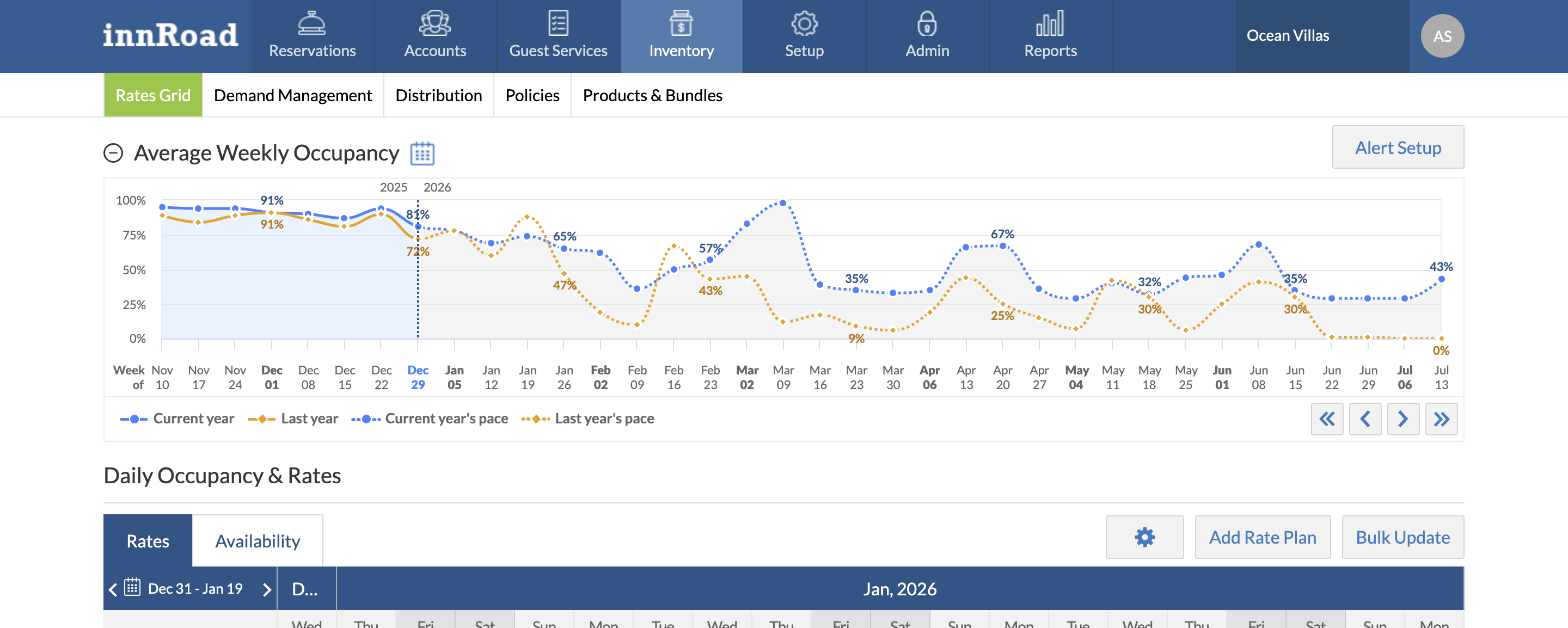
The Weekly Occupancy Graph provides a fast, visual snapshot of both historical performance and future demand trends, helping hotels optimize pricing, inventory, and revenue strategy.
The Weekly Occupancy Chart provides a visual overview of your property’s average room occupancy performance, comparing:
- Current year Occupancy % vs Last year's Occupancy %
- Current year Occupancy pace vs Last year Occupancy pace (forecast trend)
The Weekly Occupancy Chart calculates occupancy pacing based on the Booked On date and uses historical data to generate trend insights.

If there is no data for the previous year, year-over-year comparison will not be available.
You can see 9 months of year-over-year performance at a glance:
What to Use the Weekly Occupancy Graph for
Use the Weekly Occupancy Graph to
Identify revenue opportunities 9 months in advance and immediately jump to them on the Rates Grid
Stay aware of future events and overall performance in seconds rather than days calculating custom reports
Discover successful revenue actions and repeat them to better your business
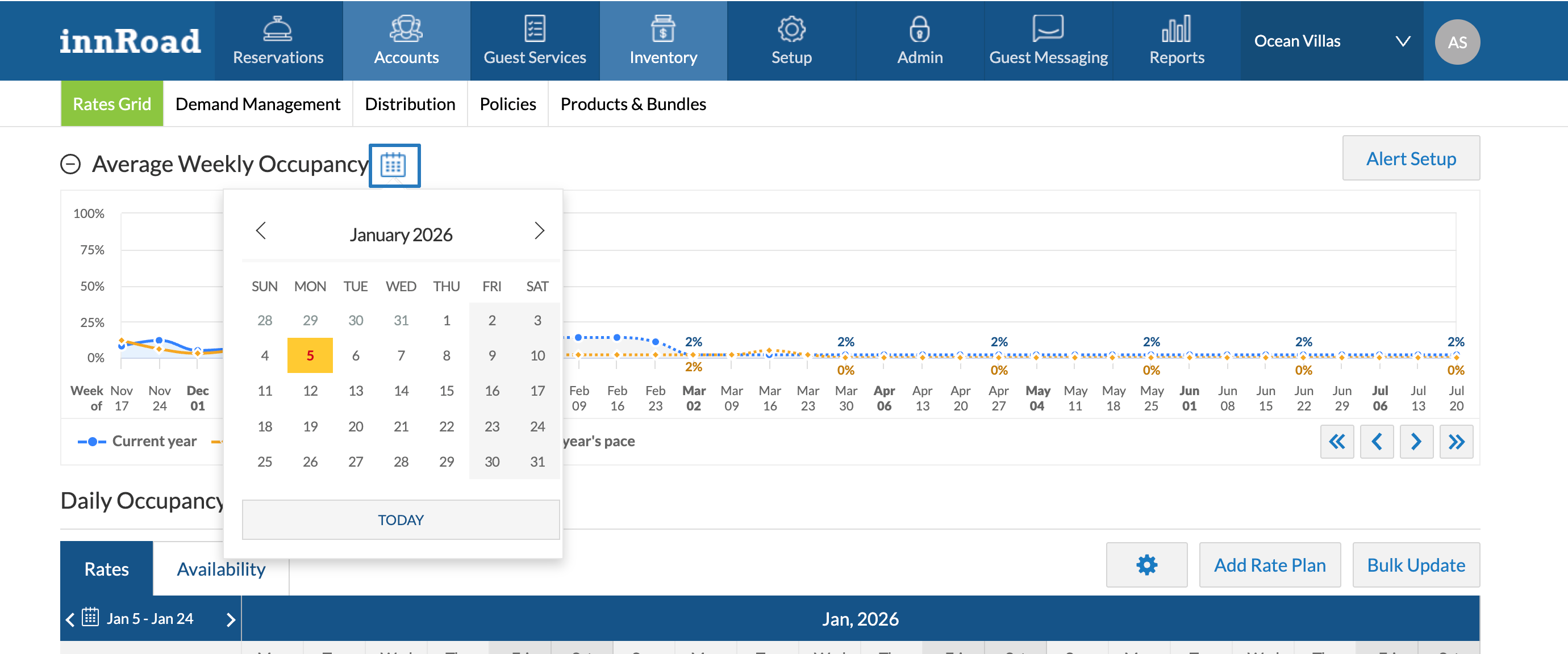
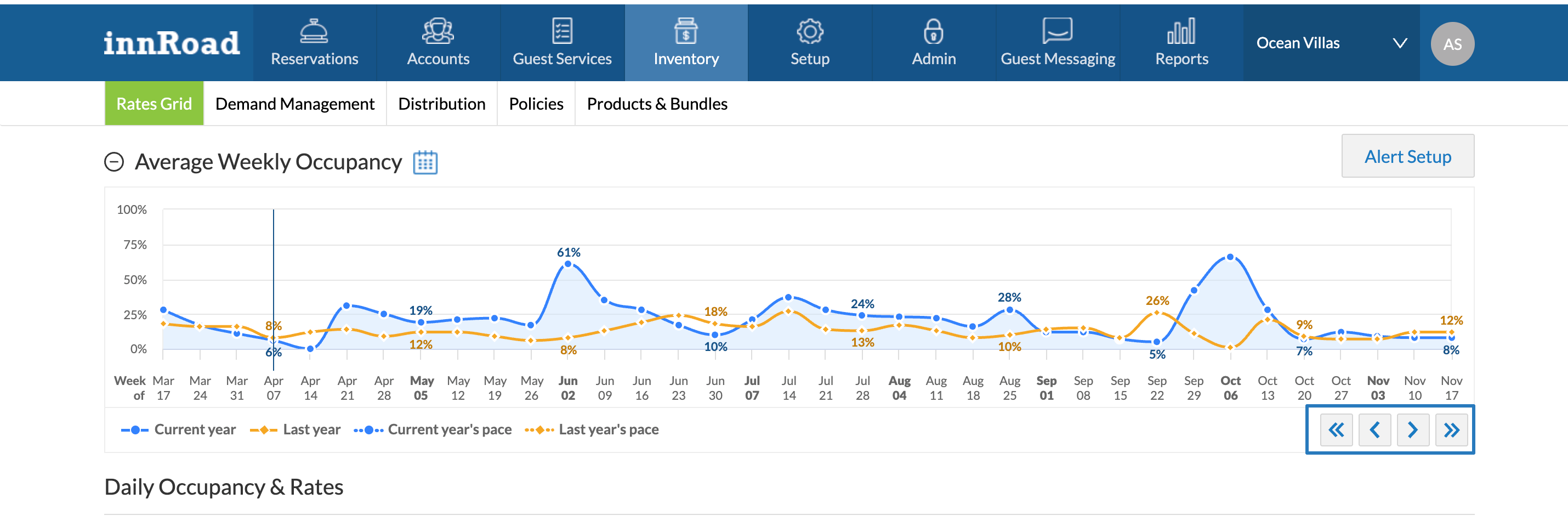
How to Use the Weekly Occupancy Graph
You can:
- Go to a Specific date by using the Calendar icon
- Use navigation arrows to move forward or backward in time on the Chart:
Was this article helpful?
That’s Great!
Thank you for your feedback
Sorry! We couldn't be helpful
Thank you for your feedback
Feedback sent
We appreciate your effort and will try to fix the article